Originally posted May 28, 2012
Consistent long term growth rates are one of the tenets of buy and hold investing. In the case of the S&P 500 this annual growth rate has averaged 5.9% since 1950 (dividends excluded, compounded monthly). All you need to do is invest early, be patient, and wait for the inevitable payoff.
The last 12 years have not been kind to this strategy, with the S&P 500 currently seven percent below levels it reached in 2000. Has this trend, which has persisted over 130 years ended? If so, there are profound implications for the people of the United States. With the on-going disappearance of privately funded pensions and the problems of social security it’s going to be tough to maintain quality of life during retirement.
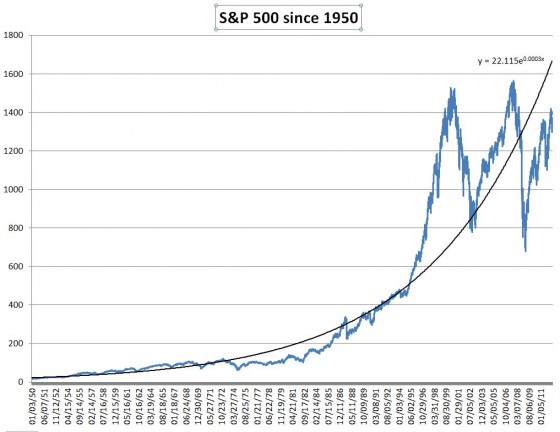
I was curious what the 5.9% rate would have predicted for the last decade or two, so I graphed the S&P over the last 62 years and asked Excel to fit an exponential trend line to that data that would reflect a constant compounded growth rate.
S&P 500 since 1950
I was very surprised at the huge gap between the historic growth rate and the S&P during the Tech bubble of the late 1990s. I had no idea the market was that far off the long-term trend line. I was also surprised that the trend line has intersected the S&P 500 twice in the last 10 years—once at the bottom of the Tech Bust, and early in the 2009 crash.
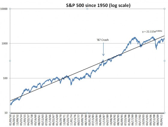
Linearly scaled charts like these can be deceptive because percentage changes at the high end look bigger than the lower end, so I re-plotted on a logarithmic scale so that percentage changes look visually consistent over the whole range of values.
S&P 500 since 1950 (log scale)
With a log scale exponential trends become straight lines.
Even on this scale the Tech Bubble looks egregious (compare it to the ’87 crash), but the bull/bear markets since then look more like previous market cycles in the 60s and 70s.
I wondered what the Price-Earnings (PE) ratios were over this time 60-year time frame. The chart below compares the S&P 500 to the PE ratio at the time. I used the PE 10 or CAPE ratio, which uses an inflation-adjusted 10 year trailing average of earnings. Historically the ratio has ranged from around 5 to 45 (the ratio scale is on the right side of the chart below).
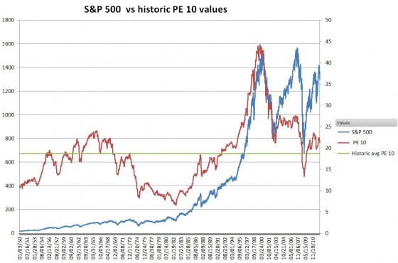
S&P vs PE 10 ratio
Whoa—look at the match between the PE 10 ratio and the late 1990s Tech Bubble / Bust. In retrospect I’m not really surprised; the dot com bubble was notorious for profitless companies with outrageous market caps. This chart suggests that the bull markets of the late 1990s and mid 2000s were driven by inflated valuations.
In contrast the PE 10 ratio of the current bull market is only a few points above its long term average.
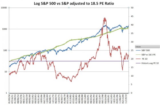
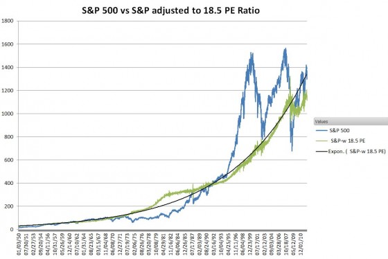
What if I adjusted the S&P index to have a constant PE 10 ratio over time—effectively showing just inflation-adjusted earnings growth? The chart below shows the intriguing results. I used the long term PE 10 average of 18.5 as the target multiplier.
S&P vs S&P at constant 18.5 PE 10 ratio
The green line shows the result. Removing the effects of changing PE ratios cancels out the market cycles of the late 1990s and 2000s. These recent roller-coaster rides have been fueled by unprecedented PE ratios that powered euphoric bull run-ups—only to come crashing down.
Looking at the data this way, the assumption that the S&P 500 will grow at a consistent growth rate feels more reasonable. The inflation-adjusted profits from the companies in the S&P 500, from 1950 until 2009 have grown at an annualized rate of 6.2%. I’m impressed.
Earnings need to grow quite a bit before they again cross the trend line, but recently they exceeded the levels reached before the Great Recession.
Instead of the Lost Decade, we really ought to be talking about the last 20 years of irrational exuberance. The combination of falling markets and rising earnings has brought PE ratios back close to historic norms, but I suspect it won’t be too many years before PE ratios start climbing again.
Of course, the “right” price for stocks is no easier to pin down than the price of gold, but 60 years of data suggests anything over a PE of 18.5 is pricey.

One of the best technical articles i’ve ever read. It makes a convincing case that 2009 was just getting back to normal valuations, and 2000 and 2007 were the aberrations. But what can explain the prolonged underperformance of the S&P500 in the 1970s and 1980s, when the PE10 was so low?
Hi Daniel,
Thanks for the feedback! I’ve been thinking about PE ratios some recently, and as an aggregate they seem to be a psychological factor somewhat removed from the realm of economics. Just as investors believed the sky was the limit before the Tech bust I suspect they were unreasonably pessimistic in the 70s & 80s.
A recent paper suggests that recent accounting changes might be impacting the Shiller analysis now. I think they make a good point. Consistent inflation adjusted earnings seems to be a worthwhile goal. http://philosophicaleconomics.wordpress.com/2013/12/13/shiller/
-Best Regards,
Vance