Update: VIXCentral has enhanced their historical term structure graphs to use days to expiration rather than months for the time axis of the charts. This change eliminates the distortions that I wrote about in the post. VIXCentral’s historical charts now look a lot like the Excel charts that I generated for this post.
Term structure graphs, like the VIX® future charts on VIXCentral.com are very useful.
At a glance, you can see futures prices for multiple months and determine whether the market is in backwardation or contango. The slope of the curve gives a quick estimate of how much roll yield you can expect at various parts of the curve—assuming the market mood stays the same.
However, some subtle errors sneak in if you aren’t careful.
A typical term structure graph has prices on the vertical axis and calendar months on the horizontal axis.
However futures typically don’t expire on month boundaries, so sometime in the current month futures expire, to be replaced by next months as the near term futures. Nothing on the chart indicates this. It’s kind of like the chain on your bike skipping a tooth—if you’re not paying attention you might not notice. In the chart below it appears that on March 20th, 2013 the term structure shifted up almost 1.5 points for most months.
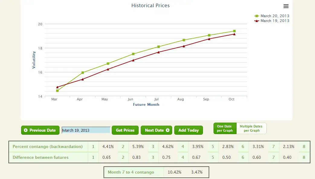
But on the morning of the 20th the March futures expired, so all the futures shifted to the left by one on the chart; the “April” price point on the 19th, became the “March” price point on the 20th. The chart below gives more detail.
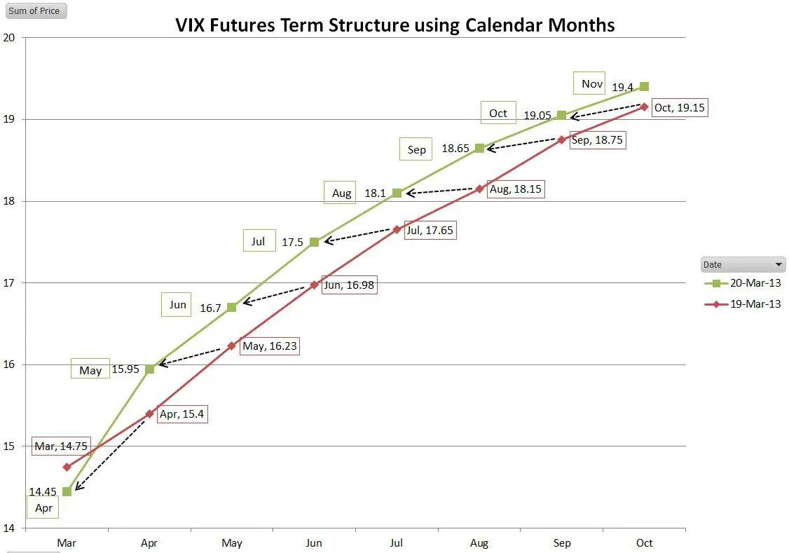
The next chart tells the real story of what happened to the term structure between the 19th and the 20th.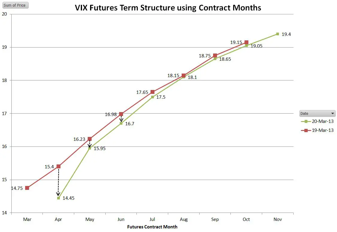
The short term portion of the term structure shifted down significantly, and the mid-term futures (July through Oct) barely moved. Whenever comparing curves be wary when you cross contract expiration boundaries.
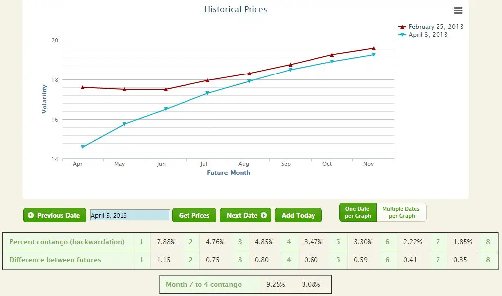
I ran into this problem when evaluating the performance of VelocityShares’ ZIV from March 5th through April rd, 2013. The contango on the mid-term futures that ZIV shorts had been steady at around 3% per month since March 5th, however after almost a month ZIV was only up 0.17%. At first I thought it might be volatility drag because there was a fair amount of chop during that period, but looking at the non-inverse ETN VXZ—it was only down .55% for the period, so if there was volatility drag it wasn’t significant. A look at the calendar based term structure below showed a mid-term curve that shifted up strongly over time, suggesting that ZIV should have lost much more than it did.
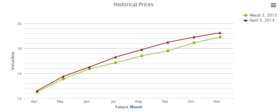
But this curve is comparing apples and oranges—the April data point has March futures combined with April expiration futures. Correcting for that we get the curve below:
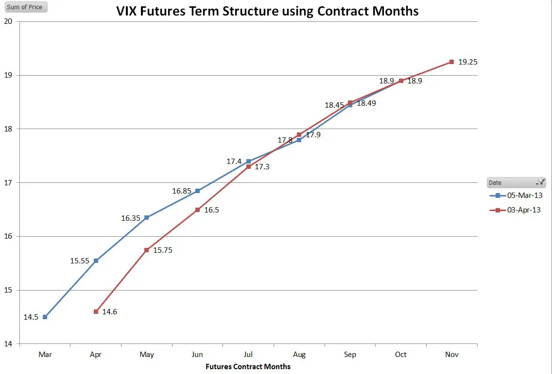
Now we see why ZIV hasn’t moved. The July/Aug/Sep/Oct futures contracts it holds have barely moved from last month’s values. The contango in the term structure has been canceled by a general rise in prices.
When comparing term structure curves between dates be careful. If you span expiration dates the comparison is probably lying.
Vance,
Thank you for this very helpful post. It will take some time, but I will implement an historical view that takes into account the actual days to expiration of the leading month.
Eli
Hi Eli, It’s an interesting problem, because if you are comparing widely spaced dates (e.g. May vs Oct) it’s not an issue. It is only deceptive on fairly narrow ranges.
— Vance
When the futures expire, the first month goes from reflecting about 1 day to expiration to about 30 days to expiration. The second from 30 to 60 and so on. The difference is smaller percentage wise for further out months.