Anyone that follows volatility closely knows that short term views on volatility are much more dynamic than longer term. For example, if the market is moving from a dip into a “V” style recovery the CBOE’s 9 day expectation of volatility VXST, will drop much more than the 30 day VIX.
A chart showing volatility expectations vs time is called a volatility term structure. The updating chart below uses indexes published by the CBOE to provide up to 6 different points on the current VIX term structure. The green dots show the numbers published by the CBOE.
The older style VIX calculation (VIXMO) is shown as the black vertical bar and the top of the purple outline around it shows the VIX value.
All VIX style volatility calculations are annualized—they indicate how much the market would be expected to vary in a year if the volatility stayed at that level. So for example if the volatility number is 15 then the model predicts that the market will stay between +-15% of the current value in the next year with a 68% probability.
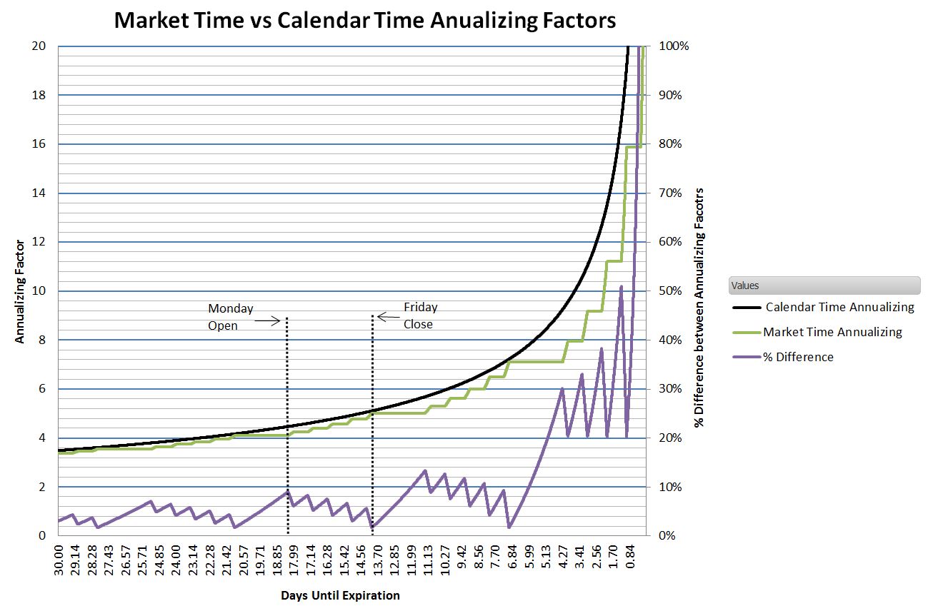
The annualization process assumes that volatility increases with the square root of time. This is a good assumption, however there is a question of what sort of time should you use. For example the CBOE uses calendar time but I think there is a good case for using the actual amount that the market will be open instead—not counting evenings, weekends and holidays. The triangles shown on the graph show the CBOE index values annualized with market time instead of calendar time. Although the two calculations often agree sometimes there are significant deviations.
The chart below shows the impact of using market time vs calendar time for annualization.
Additional Resources:
Click here to leave a comment