Everyone agrees the normal distribution isn’t a great statistical model for stock market returns, but no generally accepted alternative has emerged. A bottom-up simulation points to the Laplace distribution as a much better choice.
A well-known problem in financial risk assessment is the failure of the normal distribution (also known as the Gaussian distribution) to correctly predict big up or down days on the stock market. Even though these volatile days are infrequent, they can make a big difference in the performance of an investment portfolio. At least publically, the financial industry has not moved on to better models, probably because no alternative has been accepted as superior.
The Issue
My interest in this area stems from the frequent use of sigma notation by commenters when the market experiences big swings. For example, there was a multi-day 10 sigma increase in the value of the VIX index associated with the August 2015 correction and an 8 sigma single day downswing a couple of weeks later.
The term “sigma” is equivalent to the statistical term “standard deviation”, one of the two key descriptors in a distribution (the other is the mean or average). Sigma can be used as a shorthand way of indicating the relative magnitude of a market move. For example, if the S&P 500 drops 2.92% in a day (doubtless inciting headlines with the word “crash” and “depression” in them) we can determine the sigma level of this event as three by dividing the percentage drop (2.92%) by the S&P’s historic standard deviation (0.973%).
The normal distribution assesses the odds of a -3 sigma day like this at 0.135%, which assuming a 252-day trading year predicts a drop this size or greater should occur about once every 3 years of trading.
The odds associated with 8 to 10 sigma events for a normal distribution are truly mind-boggling. The chart below illustrates how often events of various sigma levels should be expected.
| Plus / Minus Sigma Level | Probability of occurring on any given day | How often event is expected to occur | Associated S&P 500 percentage move | Actual S&P 500 occurrences (Jan 1950-2016) vs (expected from normal distribution) |
| >+-1 | 31.73% | 80 trading days per year | +-0.973% | 3534 (expected 5276) |
| >+-2 | 4.56% | 12 trading days per year | +-1.95% | 776 (expected 758) |
| >+-3 | 0.27% | 1 event every 8 months | +-2.92% | 229 (expected 44) |
| >+-4 | 6.33×10⁻³ % | Once in 62 years | +-3.89% | 98 (expected 1) |
| >+5 | 5.73×10⁻⁵ % | One in 6900 years | +-4.86% | 50 (expected 0) |
| >+-8 | 1.22×10⁻¹³ % | Once in 3.2 trillion years | +-7.78% | 8 (expected 0) |
| >+-9 | 2.25×10⁻¹⁷ % | Twice in 20000 trillion years | +-8.76% | 7 (expected 0) |
| >+-10 | 1.53×10⁻²¹ % | Once in 2.6 x 10^20 years | +-9.73% | 3 (expected 0) |
When high sigma events do occur analysts often use their outrageous unlikeliness to promote their agenda—usually predicting the imminent collapse of the financial system and/or indict their favorite bad guys (e.g., Federal Reserve, Evil Bankers) for manipulating the markets.
I disagree. The reasonable conclusion from seeing 5 or higher sigma events in the markets should not be that things are falling apart or that the market is rigged, instead, we should recognize that we are using the wrong probability model.
Where the Normal Distribution Works—And Where it Doesn’t
Graphically comparing the S&P 500 returns since 1950 with the matched normal distribution looks like this:
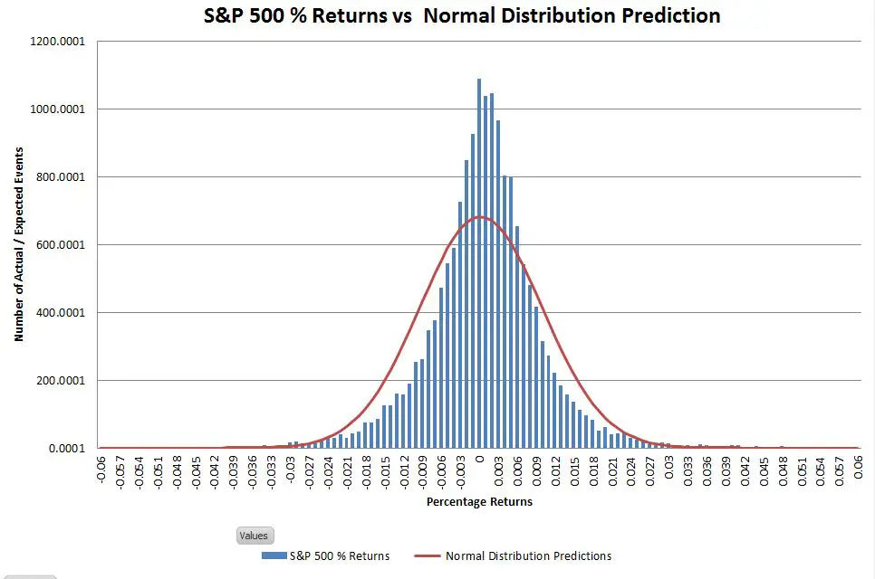
The actual returns have a higher central peak and the “shoulders” are a bit narrower, but the historic frequency of events occurring within the +-3 sigma range isn’t significantly different from what is predicted by the normal distribution. The big mismatches are in the tails of the distribution—which you really can’t see on a linear scale. Changing the vertical axis to use logarithmic scaling allows us to zoom in on the tails.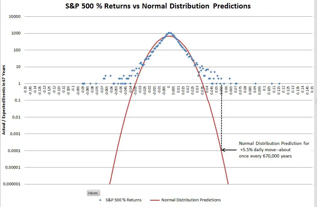
Once you get past +-4 sigma moves it’s hard to visualize how vast the differences are between the S&P 500 actual returns and the predictions of the normal distribution. The vertical dotted black line on the right side of the chart illustrates the problem. In the last 67 years, the S&P has had two days with returns between +5.5% and +5.6%. The normal distribution estimates the probability of one event of that magnitude as 0.0001 in 67 years (where the dotted black line touches the red line) —in other words, we should expect a move near +5.5% once in 670,000 years on average—and in reality, we’ve had two of them in 67 years!
From a risk analysis standpoint, this is analogous to building your house above the 670,000-year flood line and being flooded out twice in the last 67 years.
There are many academic papers proposing alternate distributions to address this problem (e.g., truncated Cauchy, Student T distribution, Gamma distribution, stochastic volatility), but no generally accepted alternative has emerged.
To my knowledge, none of these papers suggested a causal mechanism to explain why stock market returns should have their proposed distribution of returns. It’s relatively easy to torture a set of equations until it delivers the sort of distribution you desire. What’s hard is proving that these distributions will do a good job of predicting future returns. Since new return data comes in only one day at a time, it will take decades before any of these alternate proposals can emerge as superior.
So What Can Be Done?
In this section, I’ll provide an abbreviated discussion of the steps that led me to an alternative to the normal distribution. At the bottom of the post, in the “Quant Corner” section I’ll provide some details for those that want the next level of detail.
Verifying that a new model is superior to the normal distribution is tough since new historical data dribbles in too slow to be helpful. However, all is not lost—another way to verify is to come up with a realistic bottom-up model for how the stock market works and then run that model many times with realistic random inputs to generate lots of expected results. If the simulated results show a convincing match to the actual results then those results can be used to evaluate various theoretical solutions. It’s not a proof, but it’s more convincing (at least to me) than a top-down historic data matching exercise.
My approach to modeling the bottom-up behavior of the stock market incorporates one of its key characteristic—intraday correlations. Depending on the day, stocks may move randomly with respect to each other, in lock-step, and occasionally in complete opposition (e.g., oil drops in price, energy companies go down, transportation stocks go up). We can quantify the degree of synchronicity of these moves with a statistical measure called Pearson’s Correlation Coefficient, which returns values ranging from -1 for patterns moving in opposition to 1 for patterns in lockstep. I measured historical patterns of correlation between stocks by comparing the moves of one sector of the S&P 500 with another. I decided to use sectors instead of stocks to minimize the impact of corporate actions and company-specific idiosyncracies. Using 16 years of data I computed the correlation between the S&P 500 (energy and consumer) sectors and produced the following histogram: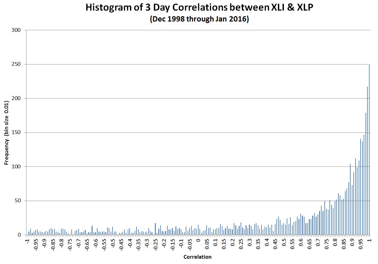
As you can see lock-step (correlation of one) on the far right is the most common situation—but there’s a fair amount of variation. This chart is representative; I looked at multiple combinations of different sectors and they all looked very similar to this result. I hypothesize that on many days the buyers and sellers of the stocks in a sector behave very differently from the buyers and sellers in other sectors, however on some days (e.g., panics, market rallies), the behaviors of all the participants in all sectors become synchronized. The behavior of crowds/rallies/mobs might be a good analogy (thanks to Asad Aziz for that observation).
Rather than try to derive a theoretical relationship from this data I took the easy way out and just used the data itself in a Monte Carlo simulation of the stock market to model 5 million days of trading with variable correlation. For each day of the simulation, I randomly picked a trading day between December 23rd, 1998 and January 25th, 2016 and used XLI’s correlation with XLP on that day to generate randomized returns for 75 different stocks with that same level of correlation. The daily returns for those 75 stocks were then averaged to generate the daily return of the “market” itself.
The chart below compares my simulated results (green line) to the actual S&P 500 and the predictions of the normal distribution: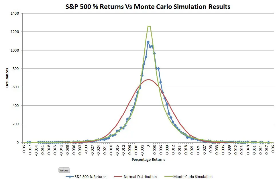
The distribution of simulated results matches the S&P 500 actuals significantly better than the normal distribution. This simulation has the leptokurtic shape (high central peak, narrower upper shoulders) characteristic of stock market returns.
The next chart uses a logarithmic vertical scale to show that the simulated distribution also closely matches the S&P 500’s tail distribution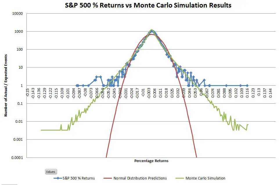
Comparing events in the tails is tricky because you can’t have partial events. Instead, what happens is that as you move out on the tails you have more and more bins with zero events. With the 5 million day simulation, I had enough data to extend out the tails considerably, but with only 16630 actual data points empty bins occur pretty quickly in the tails. I used moving averages (purple lines on the chart below) to convert these occasional events into an events-per-bin metric—providing a more nuanced picture of how the actual tails compare to the simulated ones.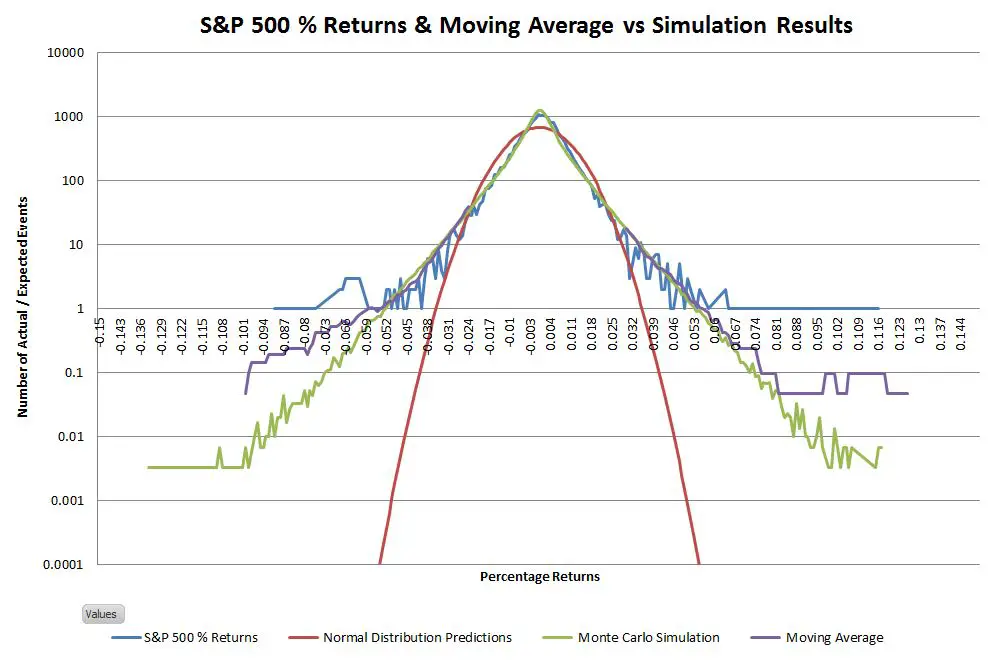
The data for the right tail closely matches the simulation. The left tail actuals are fatter than the simulation, but it’s still not a bad match
The Obvious Solution
Given the impressive match between the actual and simulated results, the next question is whether there’s a theoretical distribution that matches these non-Gaussian results.
One characteristic that jumped out at me when I looked at the logarithmically scaled histograms of actual data was the linearity of the slopes. A straight line on a log chart is an exponential relationship. Two back-to-back exponential decay curves, centered at the mean, should closely match the data. This kind of distribution is called a double exponential, or Laplace distribution.
The Laplace distribution is similar to the normal distribution in that it has two parameters, the location, and the scale factor. For a set of returns matching an ideal Laplace distribution, the location parameter is equivalent to the mean, and the scale factor is equal to the standard deviation of the population divided by the square root of two. Below an ideal Laplace distribution (black lines) is overlaid on the chart of S&P 500 actual and simulated data.
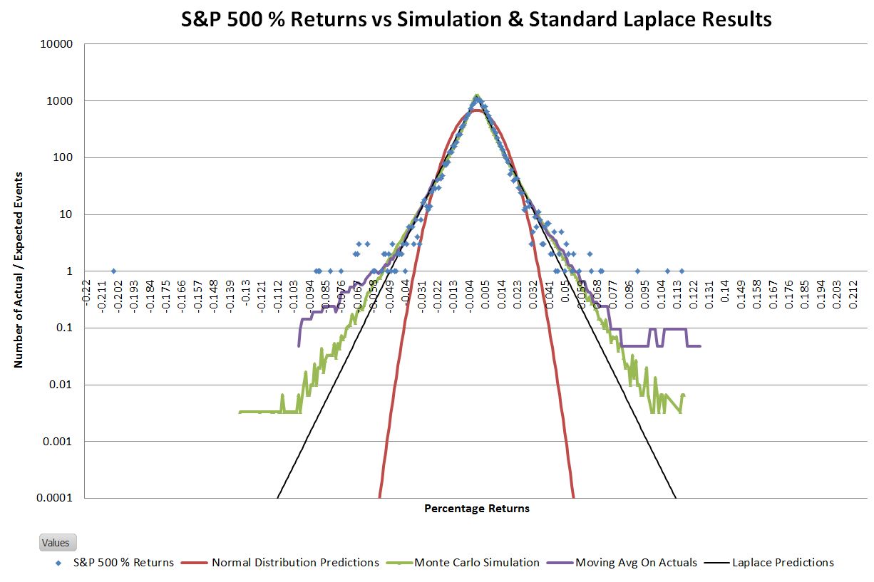
Not surprisingly there isn’t an exact match between the S&P 500 distribution and the ideal Laplace distribution; the tails of the S&P are somewhat wider. Since the goal of this exercise was to come up with a way to more accurately estimate the big up/down days I adjusted the Laplace’s scale parameter such that the number of 5 sigma or greater events was roughly the same between the predicted and actual distributions. The result looks like this: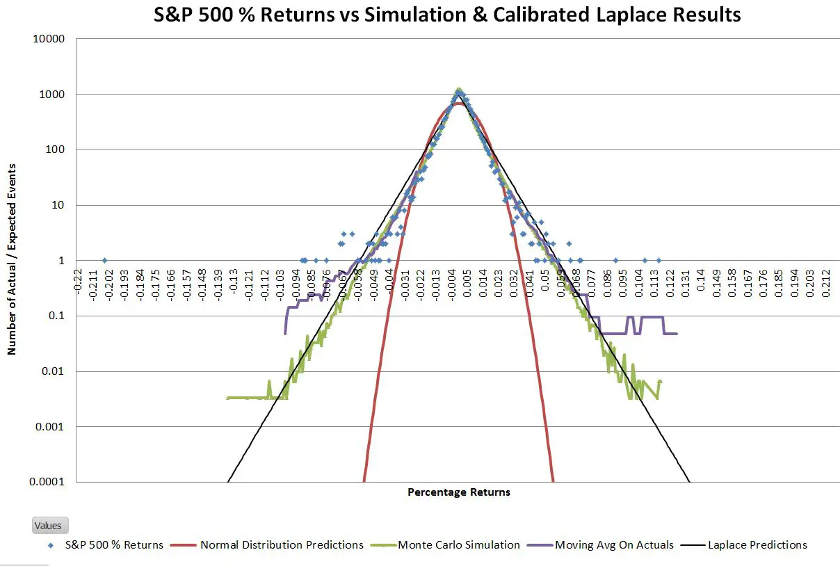
This adjusted Laplace distribution closely matches the S&P 500 historical data in predicting that every year there’s around a 75% chance of having a 5 sigma or higher event—a far cry from the normal distribution’s prediction of once per 6900 years.
The adjustment for wide tails increased the scale factor by 19% and gives a central peak prediction within 8% of the actual value. The equivalent tail adjustment for the normal distribution requires a 70% adjustment and leaves the central peak 63% lower than the actuals.
I haven’t looked at a lot of cases, but I suspect the adjustment factor will be relatively consistent. The scale adjustment for IWM (Russell 2000) is 17% and 12% for Apple.
So What?
The art of science and engineering is using concepts and relationships we know to be not quite true to generate reliable results. For analyzing market risk the normal distribution does not pass the “not quite true” test; it is seriously flawed when used to predict/analyze the more extreme moves of the market that historically happen every couple of years. It’s time to start using the Laplace distribution.
Quant Corner
- The first pass of my Monte Carlo simulation assumed that the individual stocks had normally distributed returns. A closer look indicated that individual stocks, not just indexes exhibited Laplace distributions, so I used Laplace distributions on the final simulation for all of the simulated stocks. My intuition is that the actions of the various buyer/sellers of a stock are highly correlated some days while being much more random or anti-correlated on other days—generating a histogram similar to the XLI / XLP correlation chart.
- The simulation required me to generate pairs of random numbers correlated at a specified level. This correlation changed for every simulated trading day. Generating correlated random numbers is not a trivial process. Contract the author if you would like more information.
- The Monte Carlo simulation generated returns with a standard deviation of around 14%. In order to realistically compare this data set to the S&P 500 daily returns I linearly normalized the simulation results such that its standard deviation matched the S&P 500’s.
- The equation used for the Laplace distributions shown in the charts, the probability density function is:
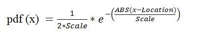
Where:
- Location is the mean
- Scale specifies the spread of the distribution ( for Laplace dist scale = standard deviation / square root(2))
- ABS is the absolute value function
- The equation used for generating random variables according to the Laplace distribution is:
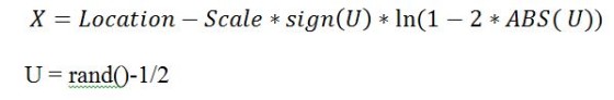
Where:
- The function “sign” returns -1 if the argument is negative, +1 if it is positive, 0 for zero
- rand() returns a uniformly distributed random number between 0
and 1 non-inclusive
- The ideal scale factor for a Laplace distribution is the standard deviation of the population divided by the square root of two. The calibrated scale factor I used to match the event frequency in the 5 sigma or larger tails was the ideal scale factor times 1.19.
Thank you, this is a great article. I noticed a similar distribution for stock returns and similar results when fitting a gaussian distribution. Larger returns (say, 3+ standard deviations away from the mean of approximately 0) were predicted with very low frequencies, while the returns closer to 0 were a good fit to the model. This was also evident in my Q-Q plot diverging from the straight dotted line on both ends. A gaussian/normal distribution was not a good fit and result in predictions that are maybe the slightest bit better than a coin flip due to the reasons you confirmed. My next attempt will be to fit the returns to a laplace distribution in hopes of better simulated results
The link does not generate the desired document. Instead, use the search function to search for rp194.pdf to get the report titled: Empirical Evidence on Student-t Log-Returns of Diversified World Stock Indices … which I think is the referenced document above.
Thanks
As one approaches retirement, an important question is how long your investments will last given certain investing strategies and spending rates. Of course you cannot know the answer in advance. But you can use Monte Carlo simulations to profile potential outcomes. If the results come back with 99% confidence, then your subsequent work is substantially different than if you come back with 10%.
I came across this post while looking for a better distribution than the normal distribution to model the markets and this looks promising. At higher levels, I generally understand what is said in your post but my confidence weakens when I get into implementing the details. So to confirm:
– Do you use the 2nd box equation (starting with “x=location -” …) to generate the random numbers for the Monti Carlo simulation?
– Is the “scale” factor expressed as the full scale (negative to positive around “location”) or is it 1/2 (like Std Dev is expressed around the mean) … if that makes sense.
I’m creating an Excel spreadsheet for personal use … and for fun… to look at the results.
Hi Nick and Vance,
Interesting coincidence in time and subject with your posts. Same situation when I found this thread today. Have a few excel monti carlo models to understand what our retirement funds will allow us to do without significant risk, but not sold on the Normal distribution underlying them. This will give me something to try out with the time I now have.
Ed … you might want to look at the Flexible Retirement Planner tool. I was going to do some Excel modeling but this tool is pretty much what I was looking for … except I think it uses normal distributions. I also like Fedelity’s … but have no clue what is behind their tool. FYI.
Hi Nick,
Yes, thanks! I have that one too and it’s the best I found and it’s a good cross-check on anything I’ve built. But it’s normal and it’s a bit cumbersome to model our portfolio. And I am a bit of a geek, so I like to control what goes on under the hood.
Yes, me too (geek). Laplace looks to be a better fit but I wonder how much results from std distributions vary as compare to a Laplace distribution (can Vance help with that question?). Is it significant for our task? Sometime I feel like I’m “measuring with a micrometer, marking with chalk and cutting with a torch” when it come to retirement planning/analysis.
Hi Robert, That would be an interesting test. I don’t know how closely the t-distribution tails match exponential decay in the low sigma ranges. That was one of the compelling qualitative factors for me in using the Laplace. I would expect the t-distribution would give a better match in the high sigma areas where even the Laplace starts seriously underestimating probabilities.
I don’t get your very first table when you calculate “Actual S&P 500 occurrences (Jan 1950-2016) vs (expected from normal distribution)”
Are you assuming that sigma stays constant over all these years to calculate the +/- 1,2,3 etc..sigma events???
Yes, I computed the standard deviation using 66 years of data, and then used that to compute the expected deviations. Of course year to year the std deviation is going to shift, but the volatility does tend to mean revert to the 66 year average.
I’m a little lost on your argument. If the individual stock return correlations and volatilities were constant, then your portfolio return should be very close to normal due to CLT regardless of the distribution of the constituents. I didn’t try Laplacian, but I bet that with 75 stocks the portfolio return will be indistinguishable from Gaussian.
So the reason why the portfolio return is not Gaussian is not because its stock returns are non-Gaussian. The reason must have something to do with correlations and volatilities. Hence, when you compare your approach to others, maybe you could start with ignoring the stock returns. Just look at how Laplacian on the portfolio return stacks up against GARCH or stochastic volatility processes, which also generate “fat tails”.
If you beat these, then you can go on compare your approach against stochastic correlation approaches.
Hi Argyn,
I agree that if individual stock returns are independent then the result should be Gaussian regardless of the individual stock distributions. In my simulations I include a random variable correlation mechanism between stocks, which I believe matches the actual behavior of the market. This correlation prevents the CLT from dominating. Subjectively, high correlations are correlated with high volatilities, so the shape of the ultimate portfolio’s distribution is influenced by the distributions of the portfolio members. When stocks are highly correlated during volatile times it is likely that higher sigma events from the portfolio members “leak through” to the overall distribution.
Vance
Vance
stock returns are correlated according to theories like CAPM, but the correlation comes mostly from the systematic factors. It’s the residual correlation that is interesting and the changes in betas.
thanks
argyn
Hey Vance,
How did you incorporate correlation into the returns that were generated for your simulation? Can you shed some details on this.
Anything similar to this:
http://rlanders.net/correlation.html
Hi Mini Trader,
The approach I used to incorporate correlation into my simulation was very similar to the approach used in the link you provided ( I wished I had known about it, it took me a lot of work to develop it on my own). The only differences are that I used a Laplace, rather than a normal distribution to generate the “raw” numbers (to reflect the reality that stocks tend to have Laplace-like distributions), and I used a more brute force way to compensate the input correlation level to get the desired correlation on the resultant distributions. The (1-correlation^2)^.5 correction looks pretty elegant, however I don’t know if would work on the laplace based raw numbers. I had to develop a different compensation for the Laplace vs Normal dist to get the desired resultant correlations on the distributions.
— Vance
Very nice article Vance Harwood. Laplace distribution seems to do a better job than normal distribution. Just a fancy request could you instead of dividing standard deviation by square root of two could you divide by square root of e?
That would be cool, but I don’t know of a justification for it. To get a good match I had to go the other direction–increase the scale factor.